CO_BUILDING

New―Renew developed a complete package of corporate identity, copywriting and website design. Values such as dynamism, progress and flow merge into a logo signet that abstracts the CO_ characters into a loop with a continuous gradient. A two-stage color concept was developed for both the parent brand and the sub-brands CO_BUILDING and CO_TRANSFORMING, which visually appeals to the particular target group.

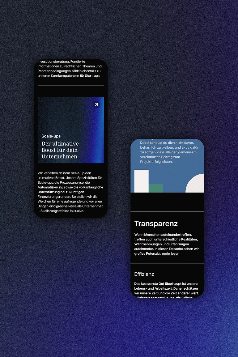
With simple, interactive animations and detailed sections, the CO_BUILDING website manages the balancing act between seriousness and uniqueness. Professional, but still special. CO_BUILDING not only distinguishes itself from traditional management consultancies, but also positions itself as a trustworthy, transparent and unique partner in the field of company building. The special feature: Each sub-brand received its independent landing page, which addresses the specific target group while remaining within the corporate identity of the parent brand.
The website headline and copy bring the companybuilding service to the point. They thrive on strong wording and an approach that actively appeals to founding teams at C-level. Through precise language, our copywriting makes the CO_BUILDING workflow tangible and transparent. The New package for CO_BUILDING was completed by CI-appropriate business cards, letter paper, social media templates and the in-house screensaver.